The Cognitive Execution Operating System for Humans
One thumb.
One system.
Your entire life.
Positivity & love community—silence will destroy it
Where does the story of ReNext begin?
The common scenario:When a task is in chronological order,
it may be disrupted by two completely different tasks of projects.
Especially when it comes to managing relationships with dozens
of clients/family.
A simple conclusion:
Productivity is broken.
Reality: Productivity tools haven’t evolved in 20 years.
Unbelievable. How dare they?
We need to break the industry’s curse.
The truth
Humans don’t think in tasks.
They think in:
meaning, memory, direction, and goal/dream.
But modern tools just ignore this.
The efficiency
High efficiency(One of 7 basic design concepts of the iPhone/Steve Jobs):
that is,
simple, clear and natural.
No chaos, no interference, no detour.
The memory resources of the human brain are limited,
reducing non-intuitive memory, thinking levels,
interactive steps, and increasing intuitive associations.
— The Art of iPhone Review by Shakenal Dimension
Transfer it to simpler terms. When we talk about efficiency,
we talk about
accuracy, process, time, and energy.
In three layers:
thinking, remembering, and executing.
There’s always a long gap between thinking and executing,
which is why we need productivity tools to help us remembering.
What's ReNext?
ReNext is a system for thinking,
remembering, and executing.
Built for the AI era.
From task management → cognitive execution
From task → What's the task and goal/dream? Where did it come from, and where was its path? Where does the ultimate goal/dream go?
The core idea of ReNext & Make the app cool again
The only thing I dare call
innovation:
the Revolutionary Philosophical Cognitive Framework.
It extends the classical philosophical question:
Where I come from, who I am, where I am going.
Your brain remembers experiences better than thought.
It evokes memory through structure,
helping you reconnect with past actions,
present identity, and future goals/dreams.
Its expand: Breakthrough project management.
Traditional to-do apps fragment thinking.
It uses to-do groups as the atomic unit,
keeping projects coherent across all pages—no chaos,
even with identical task names, even after years.
Think in projects, not fragments.
Follow & Lead the time
(Just by the way for more efficient):
Bottom-up & natural thumb-centered interaction
for one-handed user experience.
ReNext starts with one-handed use.
Interaction zones are placed in the most natural
thumb-reachable areas,
eliminating unnecessary hand switching,
mental friction, and interruption.
Stay in flow—anytime, anywhere, with one thumb.
Every gesture follows your thumb’s natural movement trajectory.
Swipe, drag, long-press, and universal back gestures
are optimized for comfort, speed, and joy.
Productivity should feel intuitive, not exhausting.
The breakthrough of ReNext
One-handed UX + single-unit cognition
=
flow state productivity
Theoretical:
Reduce memorization time by 40%–70%.
Reduce task fragmentation time by 44%.
Cognitive switching cost reduction 30% ~ 70%.
3× project completion efficiency.
ReNext vs. Traditional Tools
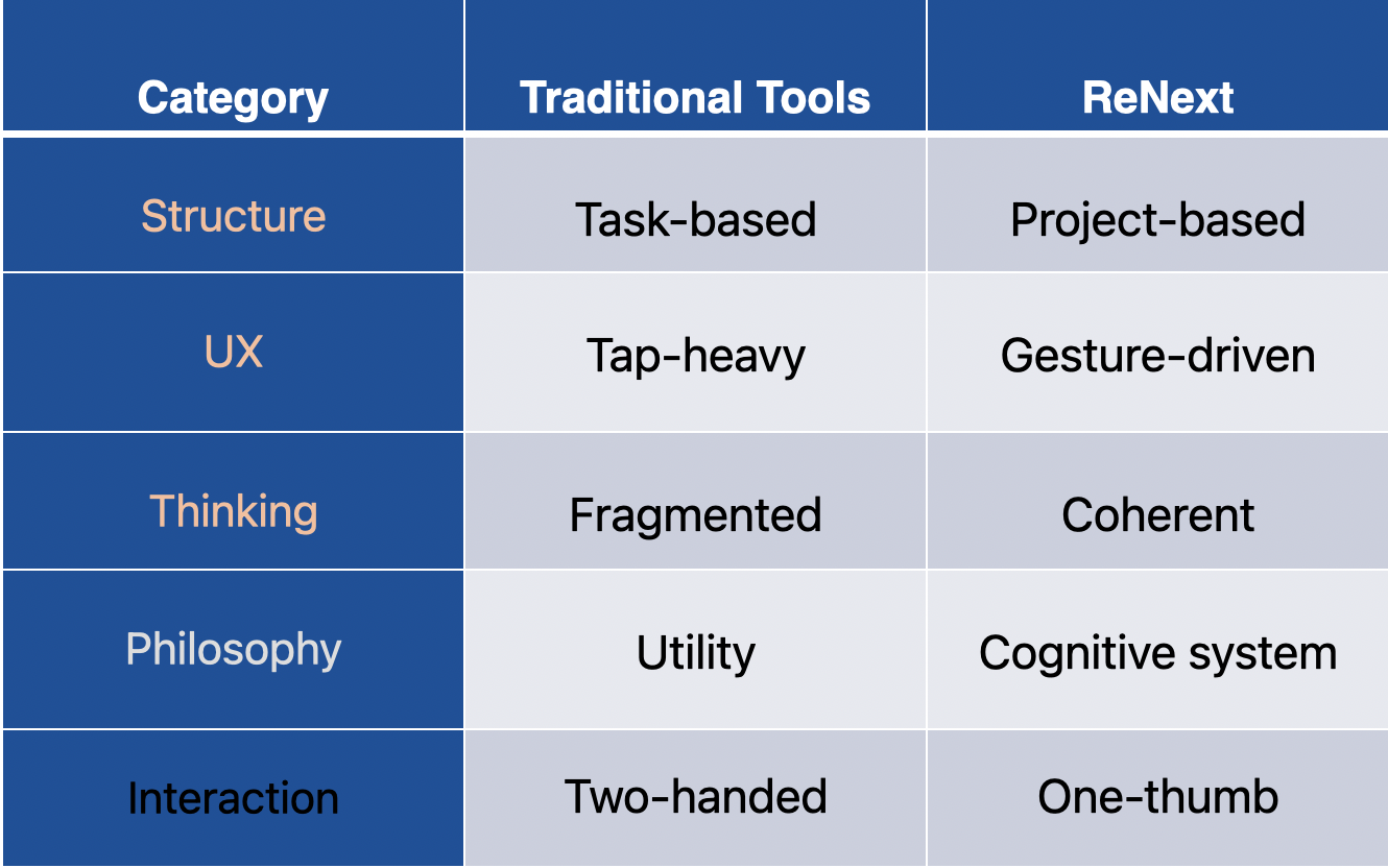
They are all converging. No innovation, even no change.
Since the internet has thrived, especially the mobile internet, software/apps has become the greatest part of our lives, but there is no one leaving space for software/apps in their products. Even Apple. But I do.
Because they don't believe they can do better, make more money, and are even more afraid of angering their shareholders, so they do not dare to change until others succeed. But I have nothing to lose.
Who needs ReNext?
1B+ global knowledge workers.
For example:
managers, office workers,
salespeople, teachers and students,
government employees, creators,
artists, writers, freelancers,
and the self-employed.
Why now? It's the era of AI.
I have to admit that it’s the era of AI.
AI increases output.
But it also brings risks:
noise, distraction, uncertain accuracy,
more processes, and hard to save time and energy.
We believe that computers significantly improve efficiency because they drastically reduce the time and energy required for calculations without adding new processes and with nearly 100% accuracy.
However, quantum computers that cannot achieve such high accuracy will always struggle to enter the commercial market.
Software may crash due to logical errors,
but it must not produce errors in its calculations,
because calculations are the very foundation of everything;
if they fail, everything will be built on a foundation of error.
AI can make mistakes.
Even achieving a 70% accuracy rate is challenging for AI,
so it’s difficult to rely on it as infrastructure with 100% accuracy.
On the contrary,
determining whether an AI’s response is accurate
requires a higher level of knowledge than the AI itself possesses.
So while AI saves time and effort,
it also reduces accuracy and adds an extra step to the process.
It’s hard to say that AI has actually helped us improve efficiency.
By the way, AI (especially AGI, which I don't believe will come true if no one will redefine it without a shred of shame or no one will upgrade the AI’s chain of thought into a complete Sacred Chain-of-thought: Philosophy ➡️ Instinct and human needs ➡️ Humanity ➡️ Religion, morality, and law ➡️ Values ➡️ Thinking system ➡️ Theoretical system ➡️ Experience system ➡️ Character ➡️ Emotion.) wants to replace everything. But when working across different fields, efficiency hinges on focus; all-in-one tools/platforms will always distract us from chasing passing the time(entertainment)—it’s human nature—and this is why AI cannot replace specialized categories, as X can't replace vertical-specific forums/media.
Efficiency becomes everything.
Thinfferent
Think different
ReNext
The completed to-do, the next to-do, and the to-do following that next to-do (ReNext) form the most fundamental project/unit within ReNext.
Vision
ReNext becomes: The layer between human intention and ultimate goal/dream.
Philosophical Principle
Technology should help humanity create a happier,
more natural life,
rather than deprive people’s abilities
or even trap them within it.
As technology advances,
the resulting increase in efficiency frees humanity
from the struggle for survival.
This newly gained time should be devoted
to the pursuit of a meaningful life.
However,
driven by human nature and deliberate temptations,
the vast majority of ordinary people instead seek
extreme emotional thrills to fill the void in their souls.
This is the logic behind the decline of human civilization.
Thus, the regression of human civilization in tandem with technological progress has become a pattern. This is not the original sin of technology, but rather an inevitability resulting from the combined influence of human nature and deliberate temptations.
Design philosophy
Love and Nature.
Minimalist.
Human-Centered.
Nature Is Simplest:
Color and space replace heavy frames and lines,
inviting exploration and discovery.
Balance:
Based on "Tao",
that is,
weakens the impact of defects as much as possible
and strengthens the sense of existence of advantages,
so that the whole is in the best state of balance.
Humanity:
Humans make tools to meet human instincts and needs,
not to endure their defects,
otherwise they are anti-human.
Optimal Visual Effect Ratio:
providing better visual design under the premise
of realizing the same product functions.
Global unified: every component and each design element follow the same design concept.
Exquisite (elegant): to pursue the maximum amount of visual information in the minimum visual unit, and the perfect spatial combination of all visual amounts of information.
Extreme: to do our best to pursue the perfection of every detail. Don't believe in the closeness of the feeling, but in the accuracy of numbers.
High efficiency: simple, clear and natural. No chaos, no interference, no detour. The memory resources of the human brain are limited, reducing non-intuitive memory, thinking levels, interactive steps, and increasing intuitive associations.
The design of ReNext logo
The primary colors are hex 777777, hex 2473EE, hex 73E247, and hex AEAEAE. The ReNext Logo background uses hex 73E247 with 12% opacity. Hex 777777 squares represent completed to-dos. Hex AEAEAE horizontal (hidden) and vertical lines on the Hex 777777 squares provide visual emphasis. Hex 2377EE square represents Next to-do, while hex 73E247 squares represent ReNext to-dos.
Founder
Shakenal Dimension
(Pen name, try Google or AI it)
Serial entrepreneur,
Apple-featured apps founder,
UC Berkeley network,
9+ years executive leadership,
multi-field theorist,
iOS developer.
Join Us
Join us in building the Human Cognition Operating System.